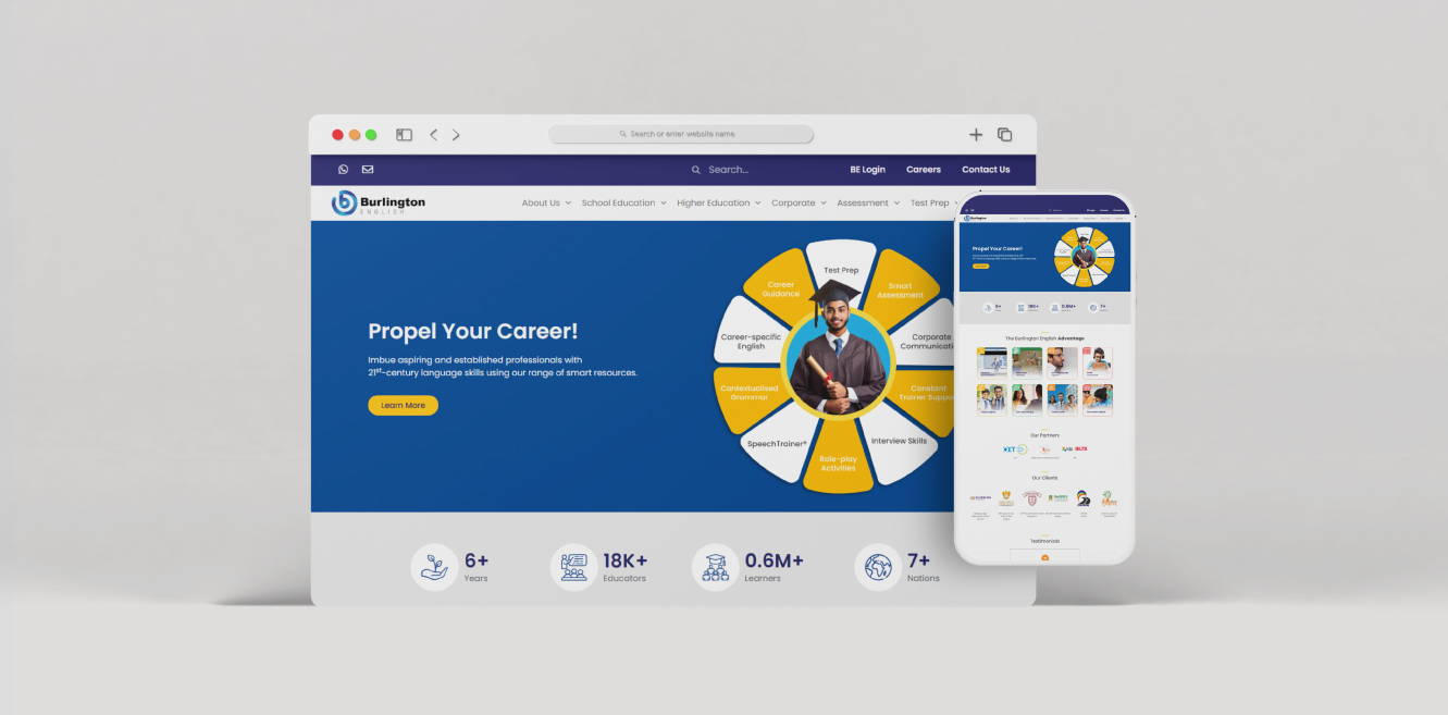
Most EdTech sites resolve this tension by either oversimplifying, flattening everything into a single message or overcomplicating, overwhelming every visitor with the full product depth. We designed a third path: controlled clarity through segment-first architecture.
Three strategic layers shaped the architecture. Each one addressed a specific failure mode in EdTech platform design and each one reinforced the others.
1. Segment-First Navigation Architecture
Instead of product-led navigation, the site was structured around audience type. Institutions, employers, educators, and learners each follow dedicated journeys with relevant proof points, outcomes, and conversion paths, eliminating the need for information translation.
2. Conversion + Education Hybrid UX
The UX follows a simple sequence: educate first, build trust through content and proof, then introduce conversion as a natural next step. For B2B institutional buyers with long decision cycles, this aligns with real purchasing behaviour. For learners, it reduces friction by giving clarity before asking for action.
3. Scalable Content System Architecture
The content architecture was designed as a system, not a collection of pages. Programs, solutions, resources, case studies, and support content follow consistent templates, enabling new content to be added without disrupting structure. The platform becomes more valuable as it scales across markets, programs, and research.